
Viewing Test viewing mobile pages Safari Mac
Test viewing mobile pages Safari Mac
|
User: Richard D. 5 years ago
|
|
| I've been testing creating mobile pages and preview the website in Safari on a Mac using Responsive design mode which should test the view under different devices. So I am expecting the view to change to the mobile page when I select a mobile device but this doesn't happen. I searched around and found Sparkle, created test pages and they render accordingly in Safari as you change the device. Am I missing something or is there some other limitation? Mobile settings double checked. | |
|
User: EverWeb Support 5 years ago
|
|
|
Hi Richard, Thanks for reaching out. The responsive design mode just shows the opened page on a selected device. Desktop and mobile pages are separate pages, so you need to enter the URL of the mobile page in the browser's search field in order to view the mobile page in the responsive design mode in Safari. Alternatively, you can install Simulator on your Mac and select any iOS device from there. In this case the mobile page will be loaded automatically. Or, just view the website on the actual mobile device. Best Regards, Alex ------------------------------- EverWeb Customer Support Submit Tickets or Learn More |
|

|
User: Richard D. 5 years ago
|
|
|
Thanks for the reply. With another app package, trial version, I can create pages and with preview, in responsive design in Safari, the appropriate page according to device will show as I navigate between the pages and select different devices. This is very handy and re-assuring to see how your design is working. With my Everwbeb test pages in preview the whole site is loaded but the pages do not change according to device selected, therefore I am unsure how they will work live. If I publish the site to disk and load it in the browser the same thing happens. Perhaps you are using a different method to detect device type? Thanks Richard |
|
|
User: Paul-RAGESW 5 years ago
|
|
|
Hi Richard, Quote: With my Everwbeb test pages in preview the whole site is loaded but the pages do not change according to device selected, therefore I am unsure how they will work live. If I publish the site to disk and load it in the browser the same thing happens. Perhaps you are using a different method to detect device type? If you build a responsive page in EverWeb it will work the way you expect. The page will adjust to the dimensions of the screen automatically as they do in the other website builders you are referring to. If you built a fixed width page and have a separate mobile page and preview it in Chrome for example, you will see the desktop page by default. Then if you switch to the mobile view Chrome does not reload the page automatically so you will still see the desktop page. In order to see the Mobile page you would use the Developer Console in Chrome and click the Toggle device button in the top left as shown in the attached photo here. Then reload the page. This is because Chrome does not automatically reload the page when you toggle the device so the detection code is not called. You can also use the Preview on Server option from the Preferences. Then you can load the previewed page directly on your mobile device by copying the URL from the Preferences window and see how it looks. ------------------------------- Paul EverWeb Developer |
|
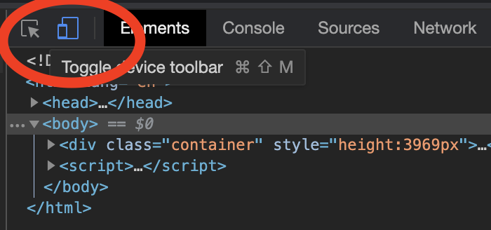 Toogle device chromee.png Toggle device chrome |
|

| Post Reply |
| You must login or signup to post. |