
Viewing Full/Auto Height?
Full/Auto Height?
|
User: J H. 9 years ago
|
|
|
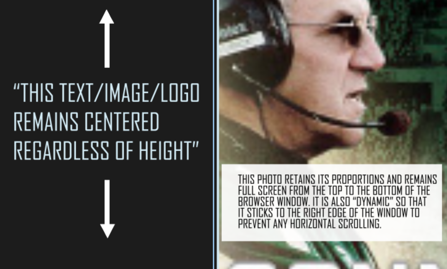
[Please see the attached image for a clearer explanation] Hello All, Can EverWeb (or its plugins) accommodate a "full-height" scenario -- meaning, regardless of the browser window's current height, the logo/object remains centered? Additionally, can full height and width be used in combination in order to keep a proportional image stretched from the top to the bottom of the browser window while simultaneously right-aligning itself with the edge of the browser window to prevent horizontal scrolling? Thanks for your help, Jack Last edit 9 years ago |
|
 Screen Shot 2016-10-16 at 6.27.19 PM.png |
|
|
User: Roddy 9 years ago
|
|
|
The best results for a responsive background image are achieved with the jQuery BackStretch plugin which is used in the Background Image widget. An item can be fixed in the center of the browser window using this CSS... <style type="text/css"> .centered { position: fixed; top: 50%; left: 50%; margin-top: -50px; /* half the item height */ margin-left: -50px; /* half the item width */ } </style> Now that all modern browser support CSS transforms, this can be used instead of having to calculate the top and left negative margins. This would have to be used in the case of a responsive image. <style type="text/css"> .centered { position: fixed; top: 50%; left: 50%; transform: translate(-50%, -50%); -webkit-transform: translate(-50%, -50%); -ms-transform: translate(-50%, -50%); } </style> The image is insert using this ... <img class="centered" style="width:100px;height:100px;margin:0;padding:0;border:none" src="file path to image/image.png" alt="logo"> The inline styles can be added to the internal styles for better efficiency. For a responsive image, use a percentage for the width and set the height to "auto". Here's a DEMO of a responsive background image with a centered logo. Adjust both the browser width and height to see how the background and image respond. In this case, the logo has been given a fairly high z-index so that it remains above the responsive text box. Reduce the browser height to see this. ------------------------------- Roddy Website: http://everwebwidgets.com Contact: http://everwebwidgets.com/ewWidgets-home/contact.html NOTE: I am an EverWeb user and NOT affiliated with EverWeb! Any opinions expressed in this forum are my own. |
|

|
User: J H. 9 years ago
|
|
| Thanks, Roddy -- just sent you a reply via your Codebox site contact form. | |
|
User: Roddy 9 years ago
|
|
|
I think the idea of this DEMO would be better so that the rest of the background image, slideshow or movie can be seen. Reduce both the browser width and height to see how it responds. I have added media queries to the styles so that the info panel drops to the bottom on iPad and iPhone like the example you referred to. Reduced the browser width to see this. You would still have the problem of having to provide a play/pause button for a video on touch devices since they don't support autoplay - similar to the one on the Touch version of the Big Video widget. ------------------------------- Roddy Website: http://everwebwidgets.com Contact: http://everwebwidgets.com/ewWidgets-home/contact.html NOTE: I am an EverWeb user and NOT affiliated with EverWeb! Any opinions expressed in this forum are my own. |
|
| Post Reply |
| You must login or signup to post. |