
Viewing problem with image pop-up window on ipad
problem with image pop-up window on ipad
|
User: Gerrit V. 9 years ago
|
|
|
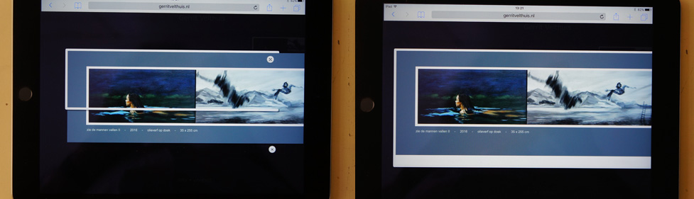
I made my personal art-portfolio-website in Everweb. One of the categories of my work are very wide paintings (35 cm high and 260 wide). These are impossible to place in the image gallery widget, because it "reserves" an area for each image (including caption) that is approximately square. So I decided to show the images individually in a pop-up window. Which works fine on a desktop, but gives problems on an iPad, because of the width of the pop-up. Take a look at the attachment; the left one shows the pop-up as it pops up, with a messed-up frame. The right image shows the situation after the expansion button is clicked, which is OK. Is there a workaround for this situation ? You can take a look at the website Last edit 9 years ago |
|
 DSC01488.jpg screendump |
|
|
User: Gerrit V. 9 years ago
|
|
|
Somehow the attachments doesn't show up. Let's try it this way http://members.home.nl/gevelthuis/screendump.jpg Last edit 9 years ago |
|
|
User: Gerrit V. 9 years ago
|
|
|
Third attempt: screendump |
|
|
User: Roddy 9 years ago
|
|
|
Can you publish a test page so that we can see the problem on an iPad?
------------------------------- Roddy Website: http://everwebwidgets.com Contact: http://everwebwidgets.com/ewWidgets-home/contact.html NOTE: I am an EverWeb user and NOT affiliated with EverWeb! Any opinions expressed in this forum are my own. |
|

|
User: Gerrit V. 9 years ago
|
|
| You can visit the website , click on "STORIES" and then on one of the four wide images. | |
|
User: Gerrit V. 9 years ago
|
|
| You can visit the website , click on "STORIES" and then on one of the four wide images. | |
|
User: Gerrit V. 9 years ago
|
|
| In the meantime, I tried to use the image-slider widget (with only one image in it, but that gives exactly the same problem. | |
|
User: Roddy 9 years ago
|
|
|
Take the fourth image for example. The image width is 1581px and the iframe which contains it is only 1170px wide. Hence the horizontal scrollbar. Even if the image width was equal to or less than that of the iFrame, it wouldn't work on an iPad. See THIS page for more info about device widths. You really need to have a responsive image in a responsive modal for it to work at all browser and device widths. Here are examples of a responsive image opened from a thumbnail, a responsive module and a CTA button. ------------------------------- Roddy Website: http://everwebwidgets.com Contact: http://everwebwidgets.com/ewWidgets-home/contact.html NOTE: I am an EverWeb user and NOT affiliated with EverWeb! Any opinions expressed in this forum are my own. |
|
|
✔ Best Answer
|
|
|
User: Gerrit V. 9 years ago
|
|
|
Thanks Roddy for your help. In the meantime I chose a temporary solution by adding a "normal" but larger page, which works fine on a larger desktop screen but also acceptable (because incidental) on an iPad. I'll take a look at your tips/links for future use. This website had to be up and running, because my first gallery show is starting tomorrow and this works fine for the time being.. |
|
| Post Reply |
| You must login or signup to post. |